
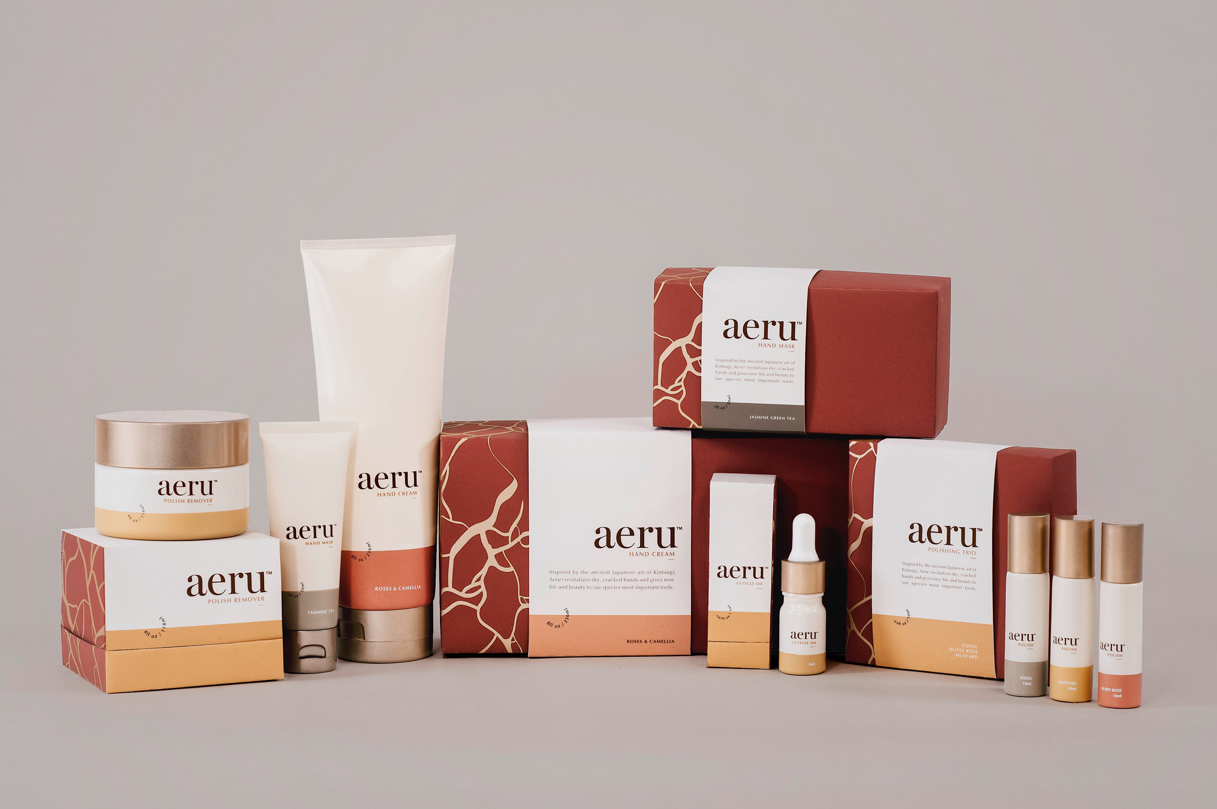
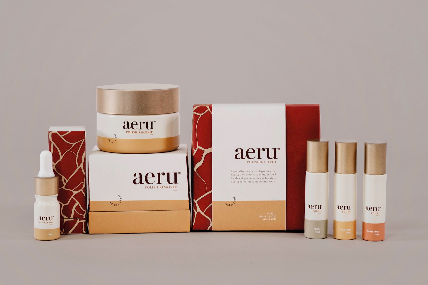
Aeru
Aeru™ is a hand and nail care line that aims mend and accentuate the beauty in our natural imperfections. The product comes with an interactive packaging component to tell the story of the inspiration behind the line.

The CHALLENGE
How to appeal to middle-aged women looking to pamper themselves without falling victim to feminine stereotypes and obvious trendy design solutions. All the while, being able to extend the brand relationship beyond the packaging experience.
THE STORY
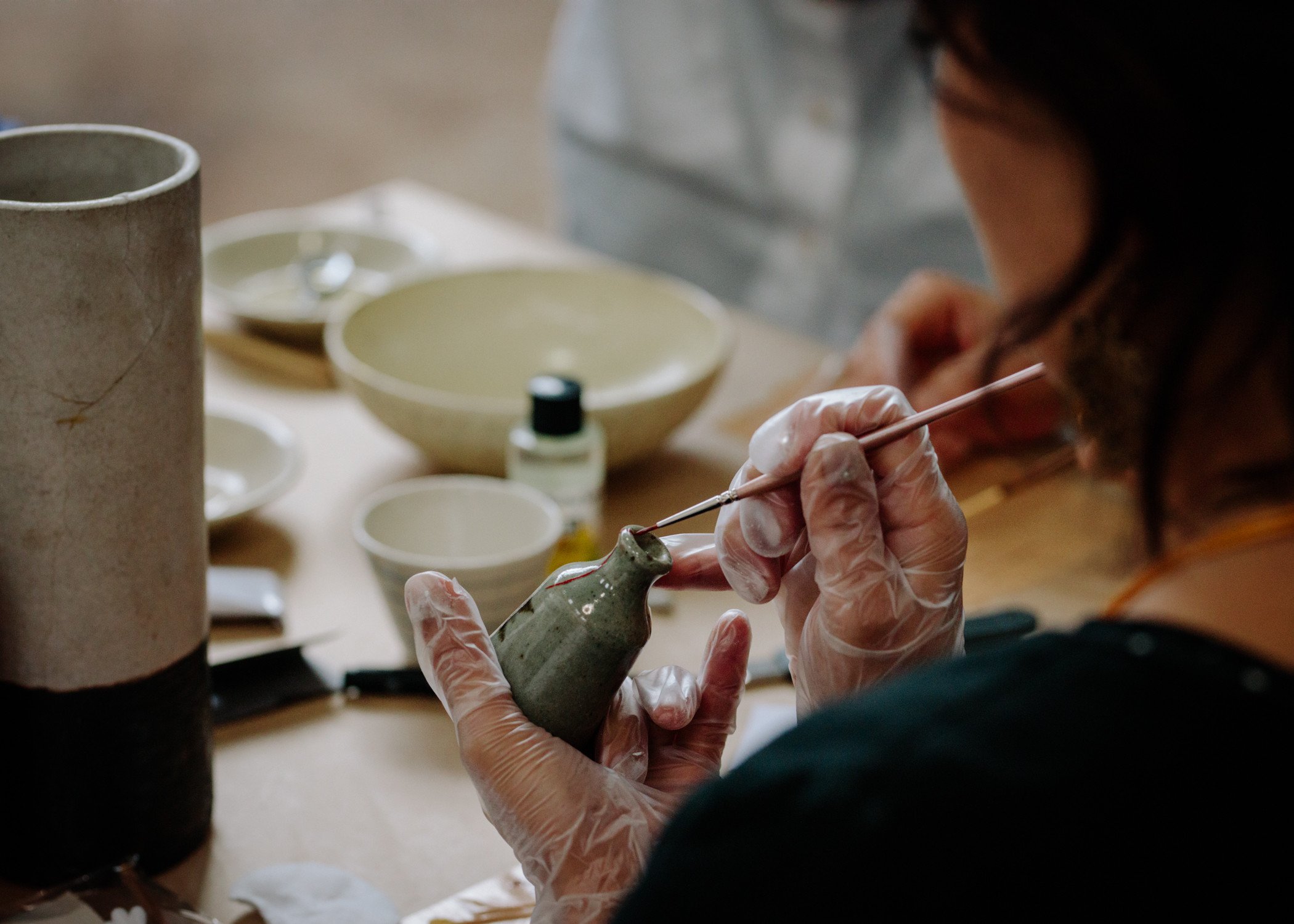
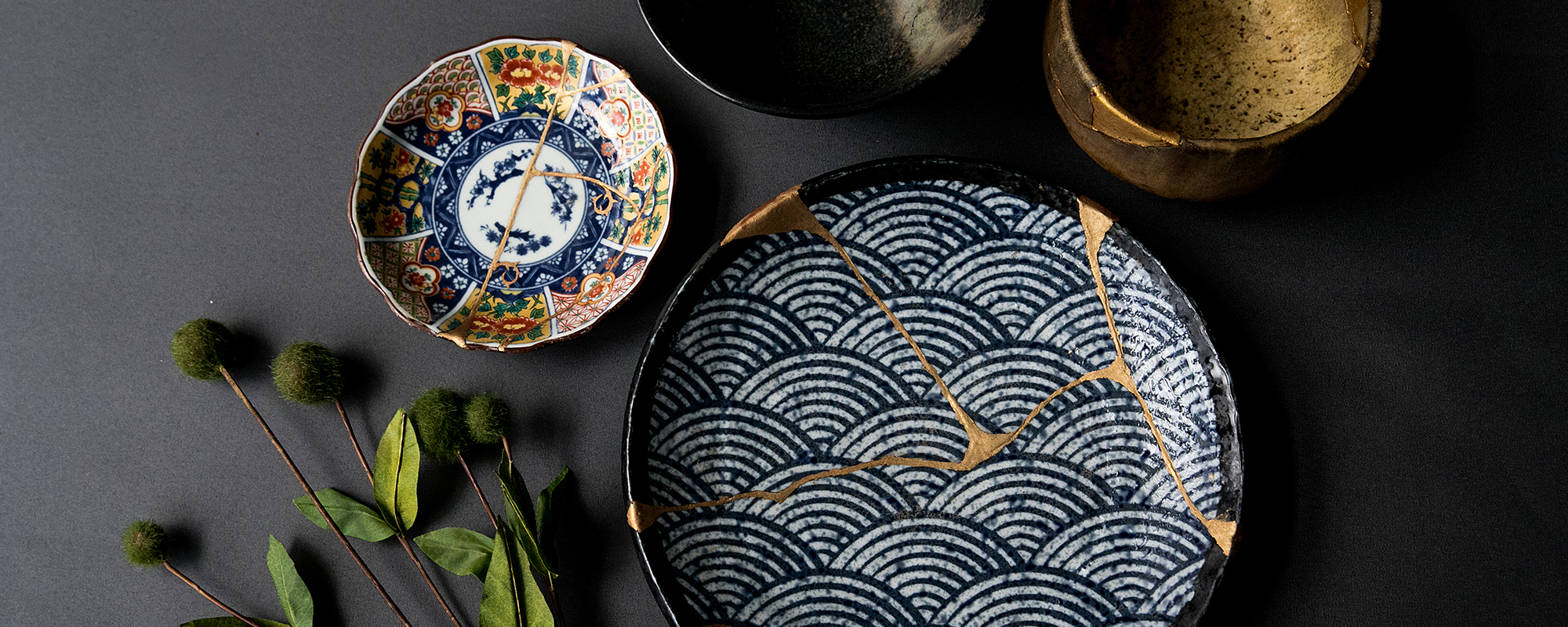
The concept for aeru™ was inspired by the ancient Japanese art form Kintsugi (Golden Joinery). When pottery would break, Japanese monks would take the ceramics and put them back together, mending the cracks with golden lacquer. It was symbolic of embracing and accentuating the beauty in imperfection. These are photographs of the process & final product of the Kintsugi art form.

wordmark & brand ideation
The word mark embodies a sophisticated & refined aesthetic alternating between a thin and thick strokes. The name derives from the Japanese word ataeru which means giving, and the word aurum. Aurum means shining dawn. Its abbreviation, Au, is utilized on the periodic table to represent gold.

Die-lines
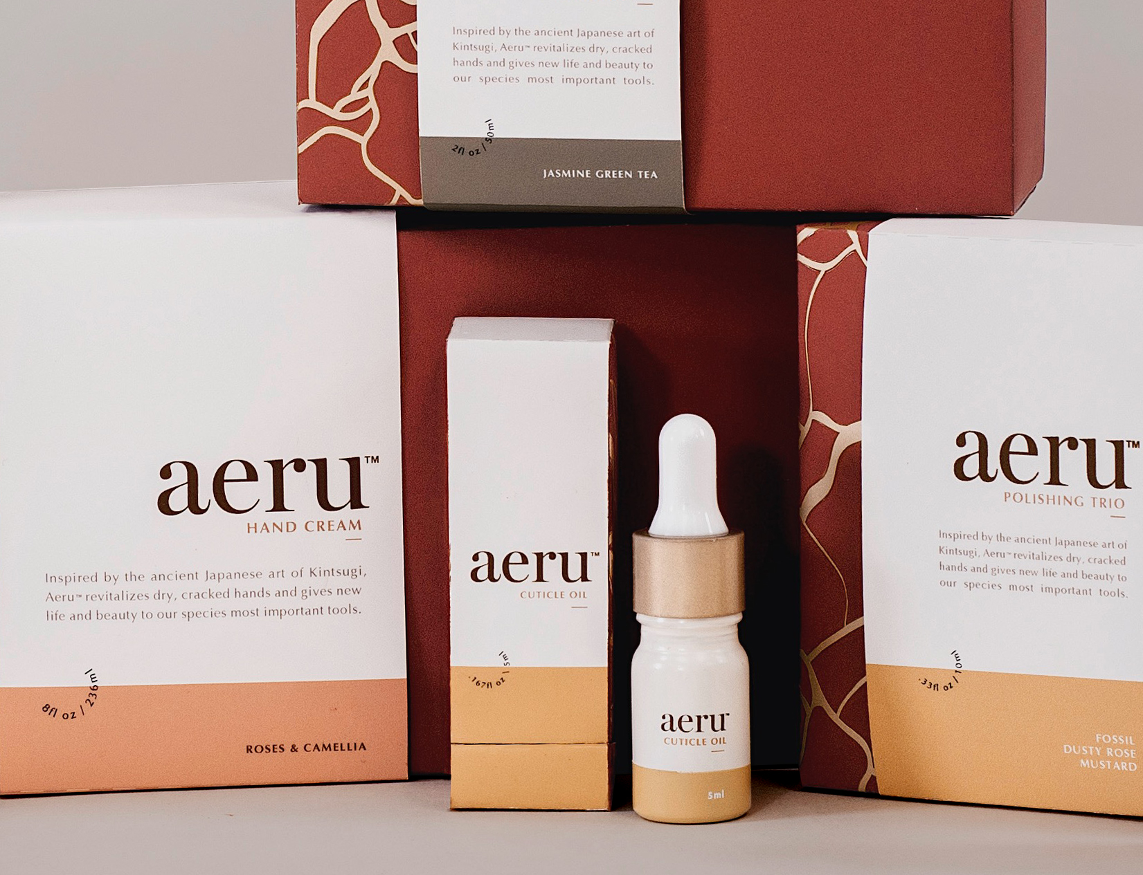
With luxury in mind, I wanted each box to be a precious experience. I developed boxes that had a lid and double-walled packaging. This created a presentation space for the products.

Prototype Process
Throughout the process I constructed over 50 prototypes and painted multiple extra sets of bottles to get my final line near perfection.

DIE-CUT METALLIC GOLD VINYL
After designing and developing the die-lines for the boxes, I hand drew, die-cut, and ironed on a metallic gold vinyl emulating the Kintsugi art from.
What makes Aeru Different
Aeru’s brand story, brings the line to life. By highlighting the beauty in the imperfect, Aeru shows women that each and every aspect of our design makes us unique. The brand also uses the packaging to make each individual piece of this line a precious experience, allowing the consumer to feel valued, special, and empowered.
THE SOLUTION
A line of organic hand and nail care designed for self-assured women ages 25-35 years old with discretionary income. The design focuses on the presentation of the bottles themselves. Each individual box is presented as a precious and luxurious experience. The color palette was inspired by ancient Japanese art and pottery.


ADVERTISING
aeru™ will be sold in boutiques and specific retailers such as Bergdorf Goodman. aeru™ advertising will be heavily photo based and displayed strategically around upper income neighborhoods in urban settings.

SMART PACKAGING
aeru™ utilizes smart packaging to tell the broader brand story. By scanning the packages, our application tells the user the story of the ancient Japanese ceramics and the story of how aeru™ is produced.
KEY TAKEAWAYS
This project taught me a lot about the physical engineering of the packaging itself. I’ve always found it incredibly difficult to work in a physical three dimensional space, but I learned to approach each project with a different perspective. I learned to let go of my fear of hand crafting perfection and work enthusiastically out of my comfort zone.